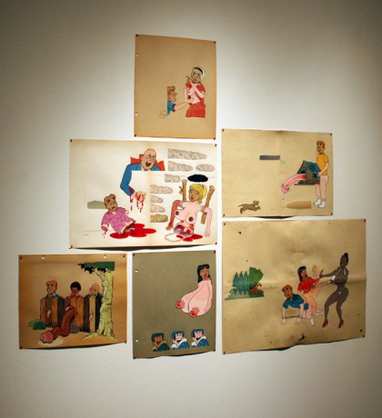
Mark Mulroney’s WEATHERBEE’S REVENGE is full of paintings that are dirty and gross and funny, operating on an adolescent paradigm where humor and violence and sexual fantasy are everything and interchangeable. Mulroney’s working process of painting his own depraved bodies under cut-out heads from Archie comics is simple enough, but the ridiculous narratives, awful jokes fit together just right with Mulroney’s clean style and fearless imagination.
In addition to the paintings, Mulroney included four painted wooden sculptures, three of which were interactive in some way. You could rearrange a chest of breasts and mysterious bumps in Archie Spare Boob, below, lever Archie and Betty into reverse-cowgirl coitus, or pull a string to give Archie a clumsy erection.
Having never actually read the Archie comics, the characters’ debasement isn’t as rending as when I stumbled onto a fan-drawn Simpsons orgy. As any unfortunate internet wanderer knows, there are massive communities dedicated to producing cartoon porn of every shape and variety and franchise crossover, and its only a matter of time before “Archie porn” shows up in this blog’s traffic statistics. However, its obvious that Mulroney’s motivations are far from any deviantart weirdo’s, giving retrospective form to a kind of innocent perversion of pop imagery.
Mulroney creates plenty of narrative variation among the pieces, some abstract and bizarre, and others shamefully clever. Every piece looks like it was floated together easily, with the artist’s illustrative handling clean and confident whether rendering a disemboweled Archie or a weeping dick in detail, showing a level of artifice and care which was, I guess, appreciated.
I give it a:
7.6
Mark Mulroney‘s WEATHERBEE’S REVENGE opened January 8th and runs through February 6th, 2010 @ ebersmoore, 213 n morgan, #3C.
(special thanks to Anni Holm for the photos)
Despite their sharp cornered, faux-wood and steel physicality, there’s an undeniable comfort and familiarity to old school stereo equipment. Like a good tube amp or a vinyl record, they suggest a warmth of sound and barely retro aesthetic which brings invisible music closer to something tangible, simple, less scary, especially compared to the layered and compounded mysteries of an iPhone. This basic theme – more nostalgic than Luddite – is at the heart of the two solo exhibitions at Rotofugi this month, Chad Kouri‘s Concoction and Rotofugi gallery curator David “Netherland” van Alphen’s In Stereo.
Netherland’s works are photos of analog electronics and stereo equipment cut out and collaged on a new surfaces (often replacing a figure’s head) and sometimes painted on with retro rainbows. The style is spot on, the presentation is clean, but while some sculptural renditions of the stereo-head people are a nice deviation, every piece is really only a variation of the one before it. They’re cool little objects though, and look comfortable being as much.
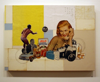
While the material shows more variation and holds the embedded content of found stuff, Kouri’s Concoction is pretty much the same story of formulaic composition. His collages, clips from a desaturated halftone Mad Men world of cigarette advertisements and happy white Americana, are put together like floral arrangements, lovingly built of appreciated materials. Kouri’s eye for design is clear, and his compositions and faded-paper color selections are rock solid.
Like Netherland’s side of the gallery, there’s a ton of work in Concoction, the most interesting of which to me were a few small, framed, but otherwise unmodified pieces of found paper. Despite the cool compositions Kouri makes in other works, whatever content Kouri adds by way of collage is really secondary to the built-in content of his materials themselves, their age and function, lost and unknown. Though perhaps included as an afterthought, I’d call these little guys the most intimate and expressive of the artist’s interest in printable media.
There’s a lot to look at in both In Stereo and Concoction, and almost all of it looks great. While it isn’t a heavy show on the head, don’t let the formulaic appearance of so much work prevent you from appreciating the details and decisions on the surface, especially in Concoction‘s collaged clusters. As Kouri suggests, in a big framed printed letters flanking the cluster of work shown above, slow down – perhaps as much the moral of the show as an instruction to viewers.
I give the whole thing a:
6.6
David “Netherland” van Alphen’s In Stereo and Chad Kouri‘s Concoction opened Friday, January 8th and run through January 24th, 2010 @ Rotofugi, 1953-55 W. Chicago Ave.
(special thanks to Anni Holm for the photos)
Filed under: Reviews
There is a certain elegance to Monument 2 special among DIY spaces, its high ceilings, stark white walls and glowing, well-maintained hardwood floors lending an edge and hone to the gallery. Fitting entirely with this style, both in its minimalist sheen and provisional underpinnings, comes SAIC undergrad Daniel Sullivan‘s SOFT THROAT, a solo exhibition most remarkable for Sullivan’s making much out of relatively little.
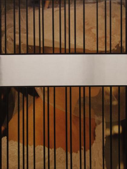
SOFT THROAT hinges on a stock photograph of a bride, digitally manipulated, sliced, and scattered among the pieces included. The majority of work are a kind of mounted collage between these bride photographs printed and fixed, along with carefully cut metallic paper, on surfaces of mostly painted cardboard or, in the above case, three tall stretched canvases. The whole effect of these materials seems to be in creating a kind of trompe l’oeil minimalism, with a strikingly clean facade which, on closer inspection, could have been done on a student’s budget.
There isn’t really much content to the work outside of its material collision with minimalism. I picked up on a quiet eroticism from the anonymous bride repeated throughout the show and the otherwise non sequitur picture of a Sappho sculpture on the promotions, but these are relatively minor themes, either stand-ins for necessary content or, at best, embedded knocks on minimalism’s masculinity. This is one of the rarer cases where explanatory material would have been appreciated, but there’s really none to find and none to be found. When I asked about titles at the opening, I was told with a smile and sweeping gesture that “everything is untitled.” Even as an appreciated satire of style, some basic questions were left unanswered.
However, I was more than satisfied with Sullivan’s provisional approach to a type of art typified by off-site expert fabrication, exactness and utmost material quality. While great care is evident in the pieces’ production, each plainly betrays its material shortcomings. Sullivan’s sculpture in SOFT THROAT looks like it could have been a candidate for any dull Serra-inspired addition to a campus collection, but chopped together of painted paneling and reflective paper, its materials remove the traditional invincibility suggested by its form.
I give it a:
7.6
SOFT THROAT: NEW WORK BY DANIEL SULLIVAN opened December 5th, 2009 and runs through January 24th, 2009 @ Monument 2, 2007 N. Point St.
Filed under: Reviews
As someone easily distracted, I have mixed feelings on music at galleries. As much as I enjoy looking at paintings, when there is music at a gallery I’ll spend more time staring at the performers or tracking the locations of speakers than I spend focusing my attention on the art. Some spaces are able to double up, like when the Co-Prosperity Sphere dims the lights after an opening’s regular hours have passed and segues smoothly into a middle-young rock concert. Other times, a smartly curated audio piece will color a whole show with its ambient clicks and whispers from across the gallery space or with the occasional bass fall hummed through a project space wall. Most of the time, though, music just distracts.
Spoke‘s latest exhibition, Co-Paintings, Cute Puppies, brought together the collaborative work of John Henley and Peter Frederiksen, along with some extra entertainment. It did have a live performance, and it did distract me from the work – but not as much as did the puppies, a half-dozen of which yelped and fought and tumbled and pissed around the gallery’s newspapered floor. Attendees pressed as near as possible to the walls, watching the band and dogs and blocking the art. There were paintings on the walls, but who could care? While the trio on my left put down a hypnotic, clinking, harmonium-led improvisation, I watched a puddle of urine bleed into an unfolded newspaper’s art section.
Unlike at a crowded opening, where an elbowed observer may think to come back in the morning when the space is clear and work visible, as this was a one-time event, with collaborative paintings created as a body separate from the artists’ primary work, it would feel wrong to discuss the paintings outside of the setting created for them by the artists. The paintings themselves were pretty cool, nets of heavy strokes and reductions which occasionally revealed scenes of docks and moorings from otherwise layered, painterly abstraction. All kept to a similar palette, shown grouped and spaced in gangs. It isn’t that they weren’t interesting, only that in a small room with great music and adorable wrestling puppies, they were the least interesting thing going on.
While I really enjoyed Co-Paintings, Cute Puppies, I wasn’t sure whether to view it as an enjoyable experience made to include artwork in a marginal sense, or an art show which, in bringing in other entertainment, ended up distracting itself from the art. Keeping that question in mind (and acknowledging that I really, really like dogs), I give it a:
7.2
John Henley and Peter Frederiksen‘s Co-Paintings, Cute Puppies was held on November 5th, 2009 @ Spoke, 119 N. Peoria. Emmett Kelly, Jim Dorling, and Michael Hartman provided the music.
With a new address, coat racks, a paneled ceiling and a floor covered in tiny stones, Old Gold has opened again with a one night show featuring the work of Aline Cautis, Josh Mannis and Andy Roche. There was the prevailing social element to the event of the kind expected at one night events, with the work itself giving a nice backdrop and throbbing beat to conversation. Check out the great video documentation below.
Mannis’s looping video collage, Variations (the source of that throb) saw the artist, dressed like a subdivision neighbor and wearing a grossly disfiguring mask, winding into digitally synchronized, then syncopated dance steps. This collaging extended to Does This System Work? #1, an infinite crowd created by edge-tracing and repeating a milling marathon. The static loop, printed on fabric (#2 was on a hat), came out more as an okay wallpaper than much else, containing all of the elements of Mannis’s video work except the best ones. The extended scope and patterning of crowd might have suggest flocking or fascist troop parades, but lacking the transformative, anxious pace of his videos, the imagery looked regular and harmless.
Roche presented two polyester hair pieces and a video titled Glass Flag. The larger and pretty awesome hair piece, Wall Do, hung like a desert island decoration, strung between edges of burlap and wood in wide synthetic grins. The other, Red Talk, saw the hair draped over the sides of a pink, blown out drawing room photo like creepy drapery, framing the image. The result was an oddly feminized image of a very male sort of event, with the middle tone false hair adding an extra touch of unpleasant gaudiness. Glass Flag showed various views, including much of the installation space itself, while a transparent plastic sheet was danced before the camera. It was interesting to watch a video of the space I was currently occupying but which that didn’t include me, but I wasn’t sure how to connect this to the idea of a transparent flag, which served more as a disruption of the scenes than the anti-political content the clear flag could also suggest.
While Aline Cautis’s paintings didn’t thrill me beyond the scratched and marked surfaces on a couple, the highlight of the show was Aline Cautis’s, 1, 2, 3, 4, which managed to bridge both video, sculpture, and drawing. The work projected 16 millimeter film, strung over a spool on the ceiling, which had been marked with thousands of small parallel lines by Cautis. These handmade lines, moving along the film loop in colored chunks, skittered on the wall when projected. It was interesting to see the same marks in motion, existing at once in two different ways on two surfaces.
One night shows are great, but I saw this one more as a welcome-back party than a full on, acutely curated exhibition. Still, the work included was solid and the pieces fit well together, even with some leaning against walls or placed on mirror ledges. I look forward to seeing something done with the fireplace.
I give it a:
SEVEN AND A THIRD
Future Facing was a one night event, held on November 13th, 2009 @ Old Gold, 2102 West Palmer.
(Note: I’m catching up on my backlog of shows I attended, photographed, and never wrote about. Enjoy the pictures and the brief summary.)
September’s main space at Western Exhibitions featured Paul Nudd, I had wanted to give Dan Attoe‘s show in the second space its own review. The show was quiet, stretching its three pieces for maximum effect and building an atmosphere of creepy, confident mystery. The central piece, Sea Kayakers (You Are Not Special) was actually a very similar to an image made by Robyn O’Neil (who was at the time showing across the hall at Tony Wight Gallery, reviewed here). However, while O’Neil’s Masses and masses rove a darkened pool; never is there laughter on this ship of fools contained almost the same content for a narrative purpose, Attoe’s use of the imagery seems more arbitrary and hallucinatory. That desert trip vibe carried through to the other two as well, which flashed clips of text and image like daily glimpses from a wounded nomad’s fever trek.

Dan Attoe, Sea Kayakers (You Are Not Special)
Dan Attoe‘s solo exhibition opened Friday, September 11th and closed Saturday, October 10th @ Western Exhibitions, 119 N Peoria St, Suite 2A.
(Note: I’m catching up on my backlog of shows I attended, photographed, and never wrote about. Enjoy the pictures and the brief summary.)
At the end of September, Dominican University’s O’Connor Gallery opened Site Unspecific, a group show which included work by Heather Mekkelson, Mara Baker, Adam Farcus, Rafael E. Vera, Brian Yates and Heidi Norton. The pieces were linked by the thread of site specificity, though each referenced a specific site outside of the gallery. Not all of the artwork here sustained the interest and had the conceptual skin to carry the theme, and some merely suggested an unknown place without going any further, but there were notable works. Adam Farcus’s sculpture, a paper chain draped over the track lights and doing much for the exhibition’s overall framing, was constructed from photocopied maps of the stars that would have been visible above at the time and place of his birth. Heather Mekkelson’s Debris Field was a reconstructed disaster, with artifacts of tragedy such as melted aluminum and burnt file cabinets meticulously reconstructed by Mekkelson from photographs of real remains. The show ended up relying on and challenging my trust in the artists’ claims, an interaction highlighted best by Heidi Nortons photographs which may or may not be accurate to their titles, and I spent the drive home wondering about that intersection of representation and belief. Without any way to validate the fact, would it matter if Farcus’s stars were from yesterday?
Site Unspecific opened on September 29th, 2009 and runs until December 13th, 2009 @ Dominican University’s O’Connor Art Gallery, 7900 W Division St. in River Forest.
(Note: I’m catching up on my backlog of shows I attended, photographed, and never wrote about. Enjoy the pictures and the brief summary.)
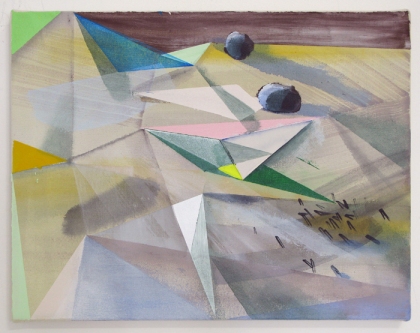
The first show at the new Ebersmoore space was also the last show at the Ebersb9 space. Given the straightforward title of Group Painting Show, and including the work of Amy Mayfield, Howard Fonda, Tyson Reeder, Sebastian Vallejo, and Paul Wackers. True to its name, it reflected more of a cool contemporary collection than any other curatorial theme. There were, however, some very interesting examples of bleeding edge interplay, including the shitty-nouveau, grungy, sculptural use of paint as used here by Reeder, the taped off, layered look used here by Wackers, and a return to traditional content such as still lifes, interiors, and even portraiture.
Group Painting Show ran from September 25th to October 23rd @ ebersb9, which became ebersmoore, 213 N. Morgan, #3C.
Last week I wrote a bit about Eric Lebofsky‘s Superfreaks at the smaller of Western Exhibitions two spaces, with the promise of returning to examine the main space and Melissa Oresky‘s A Wildness of Edges. This here is that. To start with, a few weeks before the opening of her two local shows (she also has work at the Gahlberg Gallery‘s On Paper show in Glen Ellyn until November 28th, 2009), Melissa was kind enough to let me visit her studio, giving me a great sneak peek at the mountains of work she’s been putting together over the last year and handing out a cheater’s insight into its generation and content.
The first thought I had on entering Western Exhibitions was a shock at how sparse the display was. Having hosed the Paul Nudd paintings off the walls and sterilized the studio to prevent any more from growing along the base boards, the good people of Western Exhibitions have made here a much more specific install instead. While it may have looked sparse, the way A Wildness of Edges was hung with an intention, giving three dimensions to the three elements present in the work and encouraging the triangulation necessary to see their interaction.

Melissa Oresky, A Wildness of Edges
Of the eight gridded paintings occupying the north-east corner of the gallery, four pairs of images are shown mixed between the two. Each image has its sister, with the one showing a more specific, voluminous, and solid object within a space, and its pair showing the same object but with its space reversed or extruded, and where the object is creating the space rather than occupying it.
The differences reflect a change of control, with one executed in an intentional manner, with Oresky reigning her materials into specific shapes and exerting full control over her paint; and the second presenting something of the opposite, allowing for the phenomena resulting from transparency, the skittering marks of chance, the self-generating content of material interaction and generally of a more impulsive or intuitive way of painting. As the title Rock Garden for this group might suggest, these two ways of treating a surface are to Oresky a metaphor for gardening, of imposing control over self-describing materials or of loosing those materials to compete freely. While the choices of a painter may not be that different than those of a gardener, the conclusion that the action of paint is as challenging and alive as a plant or a weed is a fun one to consider.
So to demonstrate, we’ll have two similar images, like W1, Apatite (above) and W2, Plagioclase (below), operating with the same materials of color and shape, but with each presenting different ways of painting, of presenting a landscape, and of describing space.
These pairing connections are important, and can be inferred by their palettes and their titles, but they’re not hung in a way to show this pairing off right away. I like that in hanging the work, Oresky apparently deferred to the overall aesthetic impact of the group rather than sacrifice looks to shore up the activity between them.
On the far side of the gallery, tying together the elements in the Rock Garden series and reflecting them back, is Mineral Tree. The larger painting is the most individually impressive piece in the show, a best example of the collision of shapes and colors that result from Oresky’s processes, and a solid work that balances the exhibition’s display. Containing bits and pieces of each of the Rock Garden paintings, it operates as a third corner to the work, letting the any given painting bounce both to its pair as well as its place in Mineral Tree.
There is little to complain about as far as the execution of A Wildness of Edges. The concepts and intentions behind the work are present, the manner of display did nothing to distract from them and actually gave strength to the purpose of the work, and the paintings themselves were well made and beautiful. If there is fault, its the second edge of its success. The well planned, self-imposed parameters to which Oresky kept and which allowed for the show’s success as a structure of self reference may have ultimately prevented any accident of inspiration which may have extended it into something unknown and more. As it is, A Wildness of Edges is a very well executed show of specific proportions.
I give it a:
8.1
Melissa Oresky‘s A Wildness of Edges opened October 16th, 2009 and runs through November 14th, 2009 @ Western Exhibitions, 119 N. Peoria.
Heartland is about mid-western art: its existence, its creators and their motivations, its role and its history, and its place in the larger context of American and global culture. If that sounds like too big an undertaking for one show, you’re right – the Smart Museum show is only a younger sister, the second iteration of the exhibition which was first installed in the Van Abbe Museum in the Netherlands a year ago this month. Even with two halves and a thick catalog too, attempting to describe anything as complex, geographically expansive, and nuanced as a “mid-western aesthetic” just might be an exercise of well illustrated curatorial over-reaching.

Greely Myatt, Cleave
I might as well address the issue of text, as the written word was so present in this show that it deserves first mention. Beside the many expository didactics and expansive catalog essays, almost every piece in the show included text in some way, whether the handwritten notes of Jeremiah Day, the speech bubbles of Kerry James Marshall, the acrylic tangents of Deb Sokolow, the books and magazines of Design 99, the annotated maps and posters of the Compass Group, the display case documentation of the Detroit Tree of Heaven Woodshop, the post-Katrina environmental guide notes of Marjetica Potrc; or even in the on page cursive titles of Joseph Yoakum, the pointed imagist exhibition posters, or the trippy and spare signage of Whoop Dee Doo.

Marjetica Potrc, House and Modernism Outweighed
Not only does this ubiquitous text element slow down and weigh the show, leaving few moments for the deep breath of visual experience and instead reducing many visual elements to on-site illustrations of written messages, it also projects a skewed view of mid-western art as overly wordy and prosaic. However appropriate text is in the individual installations comprising the show, including so many artists who use text in their work is simply inappropriate in a regional show like Heartland where commonalities will be mistaken for generalities. While it has its place in our history, I don’t consider text as all that uniquely mid-western and certainly don’t see it as the most salient aspect of mid-western art as suggested by its outstanding presence in Heartland.

Carnal Torpor, CalmDome
Other than that the mid-west loves to write on their drawings, what do the Heartland artists here say about mid-western creative expression? For one, we are a people engaged in specific problems. There is little contemplation of the sublime or ephemeral or critically artistic, but many questions of the realities of race, class, poverty, urbanism among agriculture, and the repeating theme of the landscape, the river, the plain, and of narratives within them. Carnal Torpor‘s CalmDome might be the most lofty of the works included, and its about hiding from those realities.

Design 99, Heartland Machine
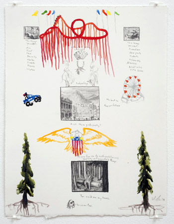
For fans of Deb Sokolow‘s work (and really, who isn’t?), Heartland provides a healthy dose with Sokolow’s three-wall Dear Trusted Associate. While not very different in content from her recent large installations, it did have some added physicality, some minor but exciting roughness with her limited materials that I hadn’t noticed in her Spertus piece, The Way in Which Things Operate (speaking of which, check out this bizarre and absolutely awesome video version her cousin made for that one). In the context of the show, Sokolow’s direct references to real businesses and even people grounds the work in Chicago, but suggests a daydream longing for dramatic narrative within a mid-west mostly devoid of spectacle, intrigue, or surprise.

Deb Sokolow, Dear Trusted Associate
The big standout in Heartland is without question Kerry James Marshall’s Dailies, the masterful ink on newsprint drawings of which the Netherland crew got to see all forty but which only a limited selection could be exhibited here in the Smart Museum. Drawing from his Rhythm Mastr series, Marshall presents multiple, weaving narratives with heady dialog instantly translated in a foam of speech bubbles, as if each speaker were a South Side polyglot demon. Marshall is still a powerhouse, and I was thoroughly impressed.

Kerry James Marshall, Dailies (detail)
There were plenty of other works present, including a rare collection of Imagist work, including the grossish and rocky exhibition flyers from the Hairy Who show; the large scale Oprah inspired digital collage by Artur Silva; a very strong double video piece by Julika Rudelius, which left me wondering among other things where and whether I can buy the leather furniture of the powerful; and a room full of curious but extremely poorly lit landscapes by Joseph Yoakum.

Imagists!
If you’re unable to visit the show, or if you want to read the accompanying essays, you can thankfully view the entire Heartland catalog online – however the good people who extended this kindness decided to do so while shitting all over the images by compressing them as much as possible. While a minor slight against every interested party who does not live in or near Chicago or Eindhoven for the sake of selling catalogs to those who do, this choice to digitally deface artwork in preference to the written word speaks volumes about the secondary role the visual side of visual art plays in Heartland.

Peter Friedl, Map (as seen in online catalog; I mean, come the fuck on)
In the end, Heartland just felt a little off, with content too dense and prosaic, and a context that not all the work included fit well into despite their individual quality. I would recommend seeing the show, but only because of the strength of certain artists’ installations, not the success or relevance of the exhibition’s thesis. I give the show itself a:
7.5
Heartland opened October 1st, 2009 and will continue through January 7th, 2010 @ The Smart Museum of Art, 5550 Greenwood Ave.


